MusicPlaydia
For this speculative project, I was tasked with designing the UI for a music app.
This app needed to include features that fulfilled needs that I felt was not met by the apps i used currently
UI Design
Case Study | Career Foundry
2019 - 2023


I analyzed several different music apps currently in the market in order to identify common features and patterns. The goal was to ensure that my design would follow standards and be consistent with the users mental models around these types of apps. My design needed to be innovative, but at the same time its functionality had to be intuitive and easy to adopt.


The Idea
Create an App where user can not only Listen music, create playlist and discover new music but also find information about Artist Biography, Album Information and Credits, the Latest News and Lyrics of the songs


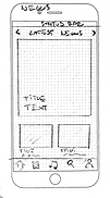
Wireframes

Iconography & Typography


Imagery and Colours
The dark blue will be the dominant colour, the grey as support for text, headings and icons. The orange will be used for Accent elements like buttons and active Icons. I opted for Blue as the dominant colour because i would like to achieve a sense of professionalism that the dark blue remind, it also give a sense of serenity and trustworthiness. The orange is used for Accent Colours because it is associated with play and energy and I like warmth contrast with the Dark blue.


Log In


