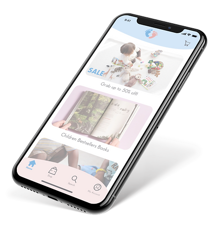
Step by Step
Step by Step is the perfect place where to to find the best products for your childrens.
A big catalogue of Books and Educational games but also clothes and Schools products. All products have been studied and tested in order to meet your childrens needs and follow Step by Step their early years.
UX | UI Design
E-Commerce | Case Study | Career Foundry
2019


Logo
The Logo want to show the main focus. of the Store, to assist and help the parents Step by Step the development of their children.

Typography | Writing Style

The Logo want to show the main focus. of the Store, to assist and help the parents Step by Step the development of their children.
The brand voice is easy, friendly, and fun, but also Professional and Inspiring.
The Brand shows positive simplicity, but also playful for kids and honest and easy for parents
Colours
The Main Colours are Blue and Pink. Blue represent colour that make feel comfortable and familiar. Pink is a playful and youthful colours. They are the perfect match for the idea and feeling that the Store want to give. The main background will be white in order to give the Store a clear and professional look.
Primary

Secondary

Iconography
The Main Colours are Blue and Pink. Blue represent colour that make feel comfortable and familiar. Pink is a playful and youthful colours. They are the perfect match for the idea and feeling that the Store want to give. The main background will be white in order to give the Store a clear and professional look.
User Flow

Low-Fid Wireframes


Low-Fid Wireframes


High-Fid Wireframes


